


Your bedroom should be your personal sanctuary – a place to relax, recharge, and retreat from the stresses of everyday life. An often overlooked detail that can truly transform your bedroom into a soothing retreat is selecting the right color scheme.
The colors you choose for your walls, bedding, and decor have a significant impact on the overall look and feel of the space. The right hues can promote relaxation, enhance mood, and create the tranquil environment you crave.
This comprehensive guide will walk you through everything you need to know to pick the perfect bedroom color scheme. We’ll cover color psychology, popular trends, expert tips on combining colors, and real-life examples to inspire your own bedroom revamp.
By the end, you’ll feel confident in choosing a palette that reflects your personality and promotes the tranquil, restful vibe you desire. Let’s get started designing your new bedroom sanctuary!
The Importance of Bedroom Color Schemes
Your bedroom color scheme sets the tone for the whole space. The hues you choose influence everything from the mood you feel when you walk in the room to how restful your sleep will be.
So taking the time to think through your color choices is a worthwhile investment. The right scheme can create a private sanctuary that allows you to leave daily stresses at the door. A palette that is too bold or discordant, however, can feel disruptive to relaxation and sleep.
When selecting a color scheme, consider the effect you want the bedroom to have. Do you want to walk into a space that has an airy, tranquil vibe? Or are you looking to create a cozy, cocooning feel? The colors you choose will play a leading role in shaping that overall aesthetic.
Start by thinking about the mood you want to cultivate in your bedroom retreat. Then use the psychology behind colors to select hues that will promote rest, relaxation and rejuvenation.
Understanding Color Psychology in Bedroom Design
The field of color psychology looks at how different hues influence moods, feelings, and behaviors. When designing a relaxing bedroom, leveraging these findings can help you create a space that truly aids sleep and eases stress.
Here’s a quick overview of how major colors impact people psychologically and physically:
- Blue – Evokes feelings of calmness and tranquility. Blue is a top choice for bedrooms because it slows heart rate and breathing to promote better sleep. Pale blues are soothing, while bold navy tones feel more moody and introspective.
- Green – Represents renewal, peace, and harmony. Green symbolizes regeneration, making it a nurturing hue perfect for a bedroom. Deeper forest greens are particularly tranquil. Mint greens have a more energizing effect.
- Yellow – Cheery and optimistic, yellow boosts mood but can also increase anxiety, which is why it’s better for other living spaces than bedrooms. However, pale buttery yellows in moderation can lend a welcoming warmth.
- Orange – Bold, playful orange is often considered too stimulating for restful sleep. However, muted burnt orange or peach tones add a gentle glow that can feel warm and uplifting.
- Red – Intense red heightens emotions ranging from passion to anger or anxiety. Because it’s so activating, red is rarely recommended in bedrooms. But if used sparingly, it can add a sense of drama.
- Purple – Long associated with luxury and creativity, purple can lend a regal, romantic vibe. Lavender and lilac shades are especially calming and spiritual. Deep purple sometimes feels overly dramatic.
- Pink – Universally seen as gentle and soothing, pink is often used in bedrooms for women and girls. For adults, soft blush pinks work best as accents rather than all-over room color.
- Neutral Tones – Shades like cream, beige, gray and taupe have a calming effect that provides a soothing backdrop for other colors. But all-neutral can feel overly stark if not warmed up with accent colors.
When deciding on colors, also consider the amount of natural and artificial light your bedroom gets. Darker shades may feel cozy and cocooning in a bright room but can look dreary and cavelike if not properly illuminated. Lighter colors help brighten a dark room.
Finally, assess the size of the space. Bolder colors tend to “close in” a room visually while lighter hues “open up” the space. So bold colors work best in larger bedrooms, while pastels suit smaller rooms.
Top Bedroom Color Trends
Now that you understand the psychology behind colors, let’s look at some of the most popular current color trends for inspiring and relaxing bedrooms.
Natural and Earthy Tones
Our increasing desire to bring the calming energy of nature indoors has made earthy neutrals one of the hottest trends. Think warm beiges, sand tones, milk chocolate browns and slate grays.
Pairing these earthy hues with lots of natural textures and materials like wood, jute, cotton and linen helps create a grounded, cozy space. Add some leafy accent art or potted plants to really drive home the nature-inspired look.
This earthy palette exudes a casual coziness perfect for weekend recharging. Plus these muted tones allow any bright accent colors you love to really pop.
Bold and Vibrant Hues
While some may steer clear of bright colors for their bedrooms, shades like emerald green, sapphire blue and even sunny yellow are popping up more and more. The key is using them artfully as accents.
Bold wallpaper, painted accent walls, or brightly colored bedding and decor add an unexpected jolt of color. Paired with mostly neutral furniture and bedding, bright hues sprinkled throughout create just enough visual interest without being overwhelming.
Vibrant colors add modern flair and personality without sacrificing the calming tranquility you want in a bedroom. Just stick to no more than two bold colors at once for a pulled-together look.
Pastel Palettes
After several years dominating the trend scene, muted earth tones are now being joined by a resurgence of lighter, softer pastels. Think airy lilacs, blushing peaches, and robin’s egg blue.
Pastels have a delicate, ethereal quality perfect for a dreamy bedroom retreat. And lighter colors visually open up smaller bedrooms. To keep pastels from feeling too saccharine, balance them with neutral walls and bedding. Then use pastel shades for accents through art, textiles and accessories.
The lighter and brighter palette of pastels creates a different but equally peaceful mood compared to earthy neutrals. It’s a great option if you want a space that’s cheery but still restful.
Monochromatic and Minimalist
On the opposite end of the spectrum, embracing one single color from floor to ceiling is another strong trend. Think serene white, elegant gray or rich blue used entirely throughout the space.
This monochromatic look helps create a seamlessly peaceful atmosphere. And limiting to one color minimizes visual clutter. Combined with clean lines, neutral textures and very few embellishments, it achieves a calming, almost meditative simplicity.
Not everyone desires such a pared-down aesthetic. But if you want your bedroom to emulate a spa-like retreat, a monochromatic color palette can get you there.
Mixing and Matching: Creating Your Unique Palette
While choosing a single color scheme is easiest, you can blend and mix colors for added depth and visual interest. Here are some tips for combining colors successfully.
Color Combinations That Work
Some pairings just naturally go together seamlessly. Here are bedroom color combinations that are easy to pull off:
- Soft blue and taupe
- Pale green and tan
- Lavender and light gray
- Blush pink and ivory
- Cream and muted sage green
In general, choose one color to dominate through your bedding and walls. Then add accent colors that are analogous (next to each other on the color wheel) for a harmonious look. Bold accent colors will really pop against a neutral backdrop.
Incorporating Textures and Patterns
don’t forget to bring in different textures and patterns to add subtle visual interest and depth. Consider:
- A knit blanket at the foot of the bed
- A fluffy shag rug to sink your feet into
- Woven woods slats in the headboard
- Linen and velvet accent pillows
- Wallpaper on an accent wall
Mixing textures avoids a flat, one-note look. Limit patterns to one or two so they stand out as intentional accents against solid backgrounds.
Tips for Blending Old and New
What if you already have existing furniture but want to update your color scheme? You can often repurpose what you have with new accents.
Pick a new color scheme you love. Paint the walls a coordinating neutral hue. Then bring in new bedding, pillows, window treatments and art in colors from your new palette that work with your existing pieces.
For large existing furniture like a dresser, consider repainting or refinishing in a color from your new scheme. Small updates like changing knobs and handles also integrate pieces.
Don’t feel like you need an entirely new room to get a fresh new look! Work thoughtfully with existing items and make selective new purchases to get the color scheme you crave.
Practical Tips for Implementing Your Bedroom Color Scheme
You’ve got color ideas swirling – now it’s time to put them into action! Here are some practical tips for implementing your color scheme smoothly.
Starting Small
If you’re still undecided on colors, start small with removable accents like throw blankets and pillows in potential hues. Live with them for a few days and see how you feel. Smaller “test runs” allow you to try out colors before diving into a whole painted wall.
You can also easily refresh a bedroom by just introducing new colored sheets, duvet covers, and accessory pillows. Add a rug with colors from your new palette. Swap in fresh curtains or swap out lamp shades. Notice how introducing new colors in layers dramatically shifts the vibe.
Choosing the Right Paint
When you’re ready to commit to paint, opt for high quality, low VOC options. Eggshell or satin finishes work well for most bedrooms. Determine how much you need based on room size.
Decide where your color will go before painting everything. Try it first just on one accent wall to create a focal point. If you want to paint the entire room, do the ceiling and trim first in a coordinating neutral.
Be sure to sample colors on the walls at different times of day. Light changes how colors look. Photograph the samples and live with them before finalizing choices.
Accessorizing with Color
Think beyond just walls to infuse more color. Add interest through:
- Colored window treatments like curtains or shams
- A vibrant rug underfoot
- Sculptural lighting in fun hues
- Pops of brightness in your bedding and pillows
- Framed wall art featuring colors from your scheme
Remember, colorful artwork, rugs and decorative accents can easily be changed out for an instant refresh when needed.
Real-Life Examples of Trendy Bedroom Color Schemes
If you’re still seeking inspiration, check out these beautiful, real-world bedrooms showcasing trendy color schemes that promote rest.
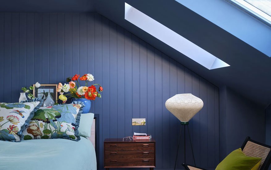
Soft Blue Bedroom
This breezy oasis uses different shades of powdery blue to cultivate a tranquil mood. The palest blue on the statement wall behind the bed contrasts gently with the richer navy on the remaining walls. White trim prevents too much darkness.
Crisp white bedding allows the blue tones to shine. A wood console table and rattan bench integrate natural texture. The overall effect is fresh and airy but still soothing and restful.
Blush and Gold Master Suite
This glamorous master suite employs a neutral foundation of creamy ivory. Richer camel accents add subtle depth. The real wow factor comes from accents in rosy pink.
From faux flowers to painted trim to artwork, feminine blush pink pops beautifully against the ivory backdrop. Metallic gold finishes on lighting and decor add luxurious shine. The overall effect is romantic and indulgent.
Earthy and Minimalist Bedroom
This simple, modern bedroom uses different natural wood tones on the bed frame, flooring and window frames as its foundation. Crisp white walls, bedding and trim keep the look airy and calm.
Pops of sage and ochre in the throw blanket and accent pillows provide subdued color. The layered neutrals and natural materials cultivate a serene ambience perfect for recharging and relaxation.
Maintenance and Upkeep of Your Bedroom’s New Look
You’ve painstakingly created the perfect bedroom color scheme. Here are some tips to keep it looking fresh.
Cleaning and Care Tips
- Dust and vacuum frequently to prevent buildup on colored walls or textiles. Wash bedding regularly.
- Use fabric protection spray on upholstery and rugs to prevent stains and sun damage.
- Steer clear of abrasive cleaners or scrubbing that could scratch paint or fade colors.
- Check for signs of wear like peeling wall paint or rug edges. Fix promptly to avoid bigger repairs.
Seasonal Updates
Reinvigorate your space by shifting accent colors and textiles with the seasons:
- In spring and summer, bring in lighter, brighter pops of color through fresh bedding and curtains.
- Transition to richer, warmer hues like spice tones in autumn. Add cozy knit blankets.
- In winter, play with moody, dramatic accents like inky blue pillows or deep green art prints.
Simple swaps keep the space feeling fresh without undergoing a whole new redesign.
Conclusion
Your bedroom color scheme sets the foundation for a space that can help you mentally recharge and ease stress. By understanding color psychology and trends, thoughtfully developing a complementary palette, and properly caring for surfaces and fabrics, you can create a personal sleep sanctuary tailored to your needs.
Don’t underestimate the power of color to influence your daily wellbeing. The right hues immerse you in beauty and tranquility so this space promotes deep rest and relaxation. Experiment with colors, textures and patterns until you craft your perfect oasis. Sweet dreams!
FAQs
What are the best colors for bedrooms?
Soothing cooler colors like different shades of blue, green, purple and gray work wonderfully in bedrooms. Neutral tones like white, beige and tan make excellent backdrops to anchor accents of bolder colors.
How do I choose a paint color for my bedroom?
Pinpoint 1-3 colors you are drawn to for your bedroom based on the mood you want to create. Paint large swatches on your walls and view at different times/lighting before finalizing. Opt for heavier grade paints that will stand up to scrubbing. Eggshell or satin finishes work well for most bedrooms.
How can I add color to my bedroom on a budget?
Quick ways to infuse color without much expense include swapping out brightly colored bedding and pillows, hanging new colorful art prints, adding a fresh colored area rug, and displaying fresh flowers and plants.
How can I make a small bedroom look bigger through color?
Stick with light, airy colors like soft blues, greens or grays which visually recede and open up smaller spaces. Bright white trim also maximizes the feeling of spaciousness. Avoid bold, dark colors that can make rooms feel closed in and cramped.
How do I add an accent wall to my bedroom?
Select one wall like behind the bed or headboard to paint a bolder accent color. Use painter’s tape for crisp edges. Prime first for best results. Use two coats of quality paint in a semi-gloss or high gloss finish for easy wipe-down.
What can I do with leftover paint?
Store extra paint properly in airtight containers so you have the exact color if you ever need to touch up walls or furniture. You can also repurpose leftover paint for future DIY projects and crafts. Just make sure to label the color.


